
A number of businesses do not divulge information to their employees, clients, customers, or management, such as how they truly achieved success, regardless of their trials and tribulations, or who decides what type of coffee is served in the employee break room, or who decides that it is a good idea to paint all the walls white throughout the office. Even though this may seem completely out of left field, it is actually an important aspect of your organization’s potential success. The décor, down to the color of the walls, can have an effect on whether or not your team is motivated and how successful (or not) your practice is on a daily basis.
Paint the Walls
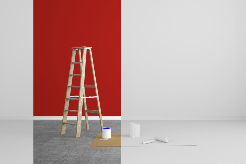
We have all heard the expression, “Paint the town red.” But have we ever considered the significance of this expression? There is a good chance that the answer is no. For clarification, it is the act of going out and having a good time.
How does this saying relate to your office? The truth is that the colors that surround you have an impact on your level of productivity at work. Alternatively, it can impact how little productivity is achieved in your office space, depending on the color choices your organization chooses to incorporate.
Research Behind Color Inspiration
Uncertain how this plays a role? Research supports this claim. Dr. Nancy Kwallek, a professor at The University of Texas at Austin, conducted a study on the use of color in the workplace. For approximately 90 different workers, Dr. Kwallek examined three different color schemes – red, white, and blue-green – to determine their mood and the relationship between it and their level of workplace productivity.
Three color-scheme offices were assigned to each employee: a white office, a red office, and a blue-green office. According to her research, each color scheme has its own level of productivity, but there is no direct correlation between the color of an office and the mood of its employees.
There is evidence that white rooms are the most counterproductive of all colors because of the lack of contrast and saturation within the workplace. Nevertheless, most work environments tend to be neutral in color, consisting of white, off-white, or gray colors and tones, both on the walls and in the minor pieces of decor. According to Dr. Kwallek, this color signifies sterility, which indicates a low level of work. According to her, this color is so dull in nature that it causes the greatest number of mistakes. This tone also led Dr. Kwallek to believe that the color scheme is the least stimulating.
The colors, on the other hand, can enhance the level of stimuli represented when they are part of the color scheme in which you work. It appears that red is the most stimulating color, just as the expression goes. Go ahead, be stimulated, and have fun. The color is likely not to be the best choice for walls and other forms of décor in a workplace environment, such as paintings or furniture. This study revealed that the color red shifted emotions at an all-time high and resulted in a high level of errors and an increase in blood pressure in participants.
As part of Dr. Kwallek’s experiment, high screeners and low screeners were compared. Those who participated in the red environment reported more dysphoria than those who participated in the blue-green environment. In the red room, high screeners perform better on office-related tasks. Individuals with a high degree of attention to detail performed best when placed in the red room. This is consistent with only C Type Personality Styles. Approximately 8% of the global population falls into this category; thus, red rooms are less productive than any other color or personality type.
In contrast to red, blue-green had quite the opposite effect. In spite of the fact that this color scheme was stimulating, it did not overstimulate. As compared to red and white, it prompted the highest level of productivity. Historically, blue (especially pastel blue and blue-green colors) has been associated with relaxation and pleasantness. According to preferences with regard to the office setting, this color was the most preferred. This type of room tends to be more conducive to low screeners than to high screeners.
The color blue itself is often referred to as the color of depression. In the workplace, however, this is not the case. As compared to all other colors, blue, specifically blue-green or pastel blue, shows the least amount of negatively and has the greatest degree of pleasantness.
The Complexity of Your Office
In terms of choosing a paint color for the office that your employees work in, is blue the most frequently requested color? According to Dr. Kwallek’s study, yes. This type of color scheme was preferred, requested, and calmed by a greater percentage of respondents. Most offices, however, have a neutral color scheme.
In light of the extensive research that has been conducted, the question remains, “Why?” Why are organizations reluctant to embrace pastel colors like blue-green and bolder hues? Some practices recommend using neutral colors when decorating a workplace. White can make a space appear brighter and more spacious, and it does not distract workers from what their work entails.
It is possible that this is something that requires a greater level of attention for the future. In spite of the fact that it is easy to coordinate, less distracting, and makes the room appear larger than it actually is, it actually lowers the productivity of many employees. Colors that are predominantly neutral are simple to consider and implement, but they tend to be counterproductive at best.
Conclusion
Whenever your organization asks for feedback on what you would like to see done differently within your work environment, you shouldn’t hesitate to speak up and let them know what you think. Ask your office manager for a color scheme to put in place so that you can boost your productivity around the office. But not just any color scheme will do, you need to ask for something in blue, blue-green, or a pastel shade of blue as your main color.
The use of this color scheme will add a calming atmosphere to the office and increase productivity at the same time. You can paint the town red, but in terms of your workplace, you should paint it blue in order to reap the benefits it brings in the future.
Sources
- Kwallek, N. (1996, April 14). Impact of Three Interior Color Schemes on Worker Mood and Performance Relative to Individual Environmental Sensitivity. Research Gate. Retrieved October 10, 2022, from https://www.researchgate.net/publication/232444027_Effects_of_Office_Interior_Color_on_Workers’_Mood_and_Productivity